Type · University of San Francisco, Thacher Gallery
Market/Value
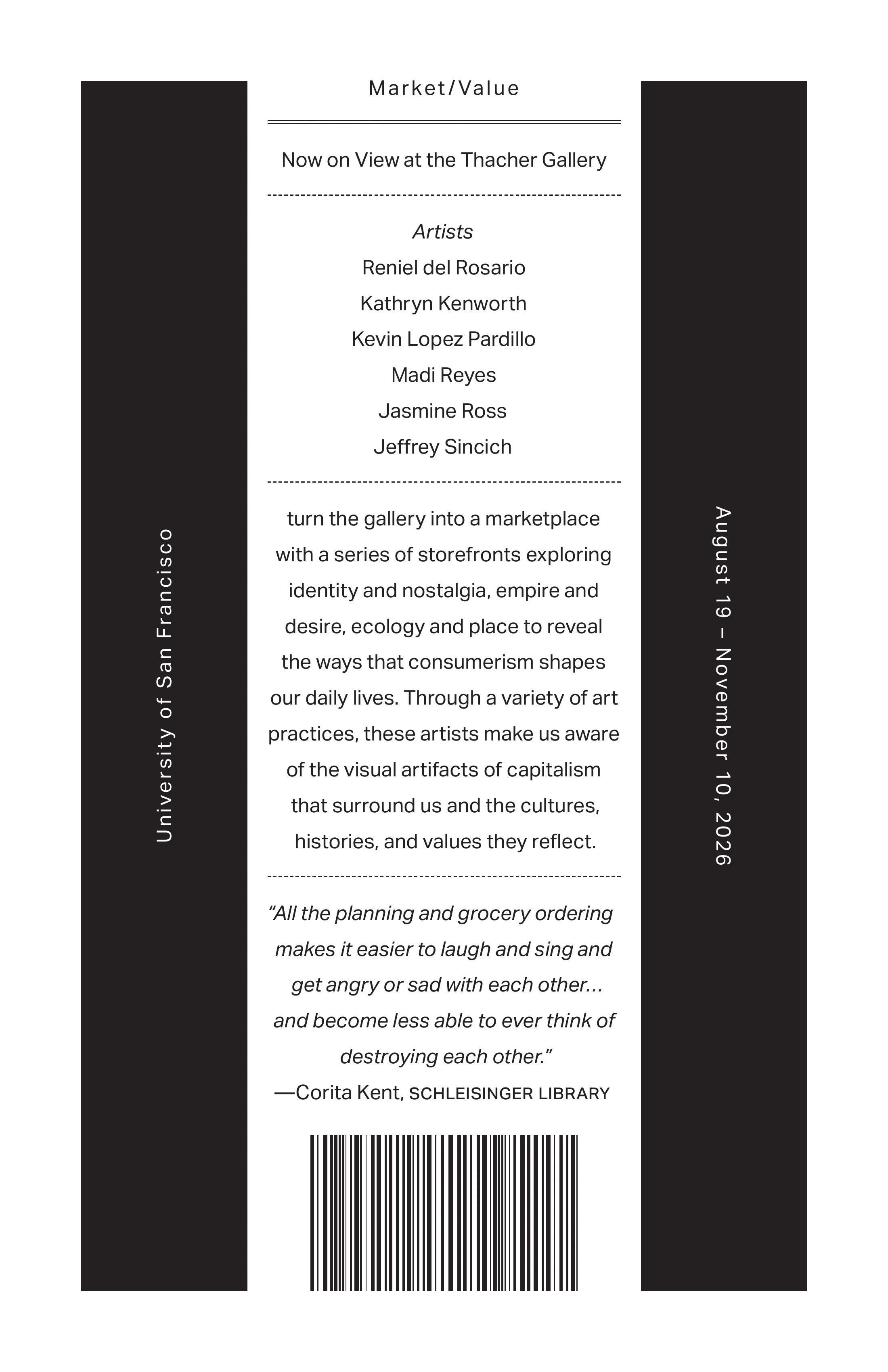
An exhibition poster for Market/Value at the Thacher Gallery, where six artists turned the gallery into a marketplace of storefronts. The brief allowed one typeface, one size and one weight, in black and white.
The brief
- 01Aktiv Grotesk Regular, with Regular Italic when needed, at 18/32 only. One size, one weight.
- 02An 11 × 17 in vertical page with 1 in margins on every side.
- 03A grid of four columns and six rows with a 0.25 in gutter.
- 04Black and white only.
- 05Three compositions: flush left, flush right, and centred or justified. This is the centred one.
- 06Push the prompt, but keep illustrations to a minimum: bars, broken text and vertical type were fair game.
- 07Get the rags, dashes and quotes right.
How the constraints became the design
Hierarchy without size or weight. With every word at 18/32 in Regular, I ranked the information with space and position instead. The title, Market/Value, is letterspaced wide and sits alone above a solid rule. Artists is the only italic label. Dotted rules split the column into its parts: title, artists, statement and quote.
Bars as architecture. The two outer grid columns became full-height black bars. They frame the centred text like a storefront, and they carry the two facts that frame the show, University of San Francisco and August 19 – November 10, 2026, set vertically and reversed out in white.
Why a barcode. The exhibition's theme was a market storefront, and I wanted a graphic that said so. Pictures weren't allowed, but bars were, and a barcode is nothing but bars. It turns the poster into a price tag for the show, and it is the clearest image on the page. The limit I wanted to break ended up giving me the strongest idea.
The details. The centred lines break by sense, not by width, to keep the rag even. Quotation marks are curly, the attribution starts with an em dash, and the date range uses an en dash.
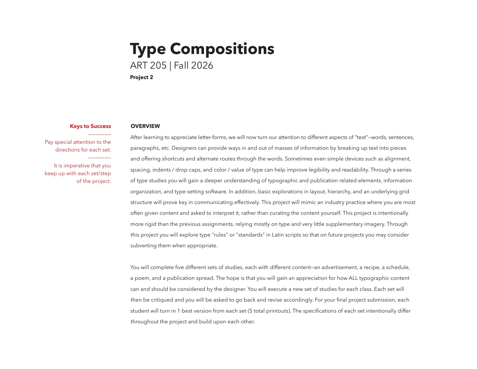
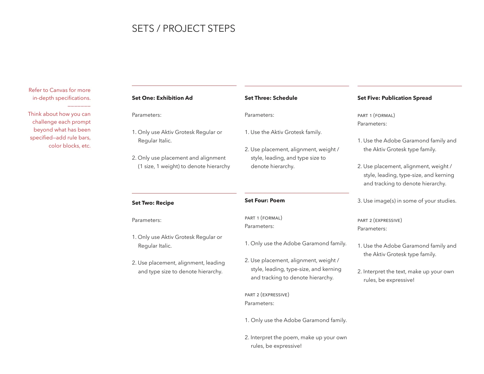
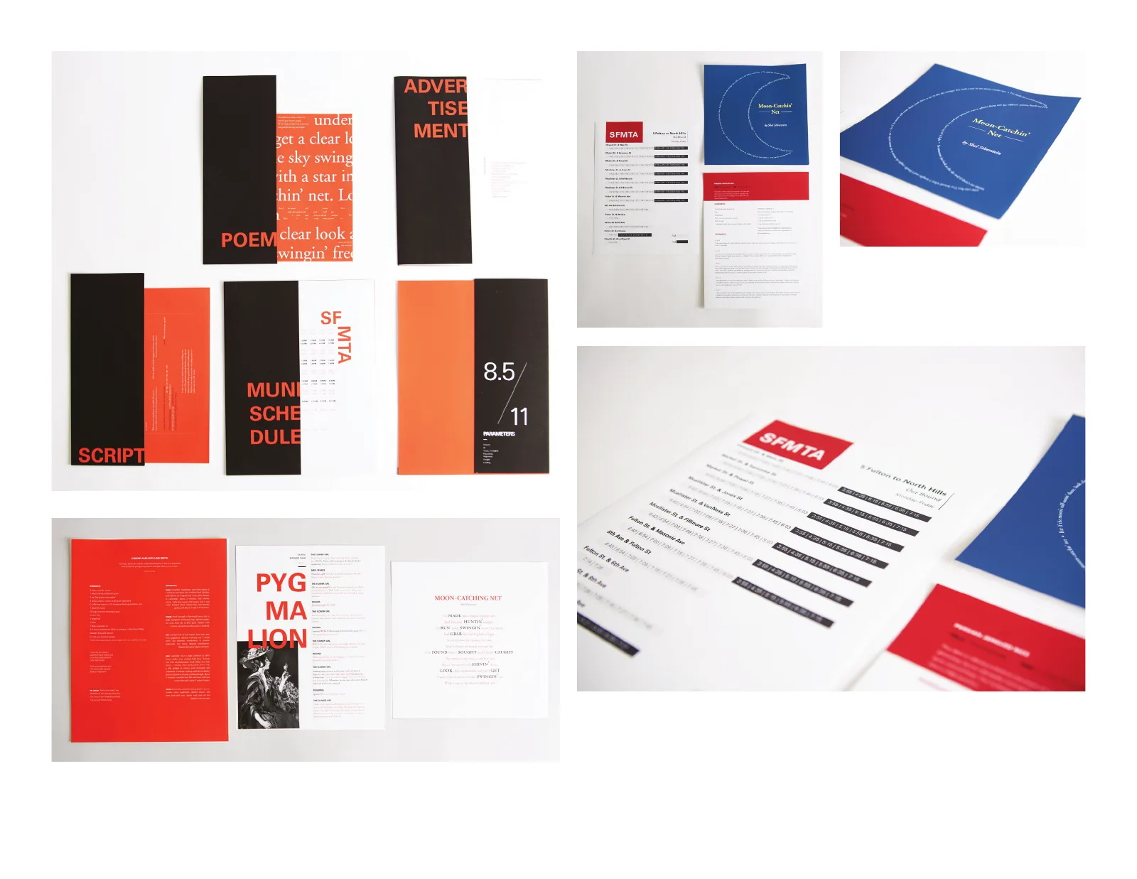
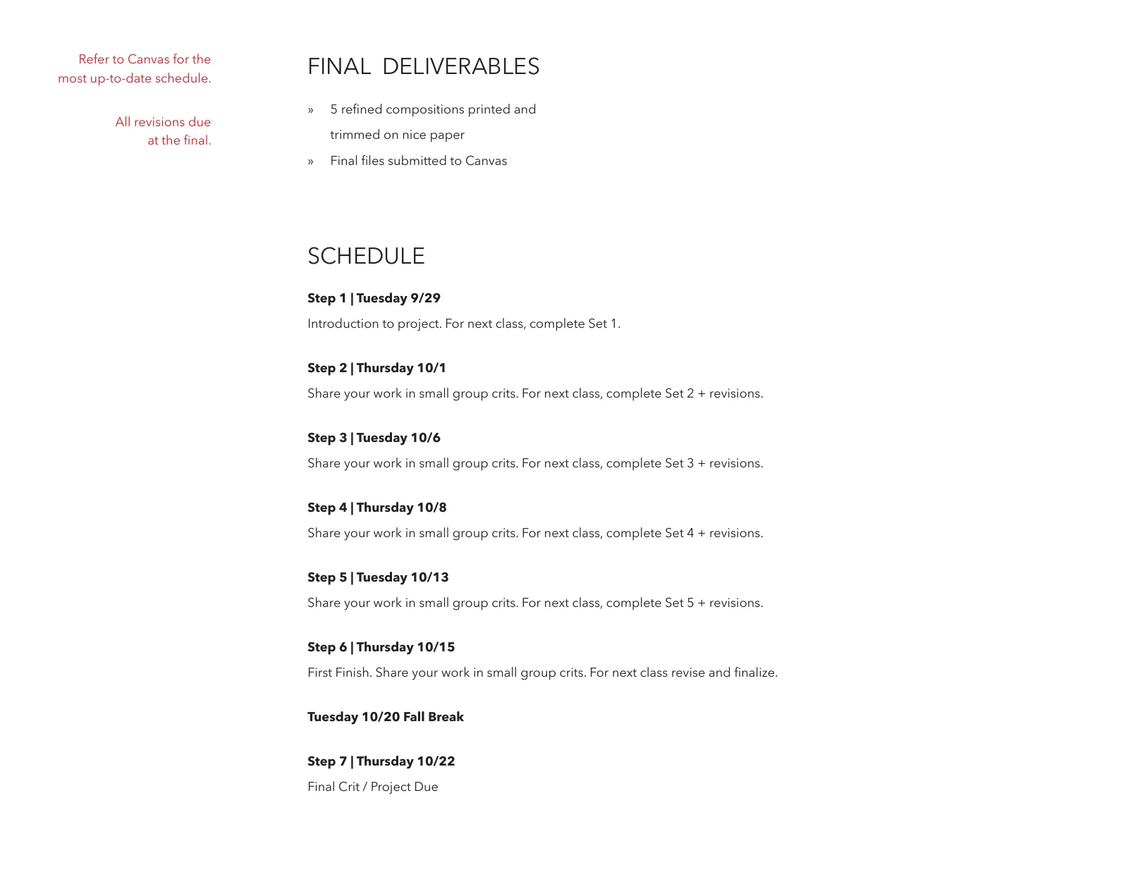
Type Compositions brief
The project brief and rubric from ART 205, four pages. The poster above answers it point by point.